-
July to September 2026
in progress
2026.3
New
- Search from anywhere. Ctrl+K (⌘K on a Mac), or the magnifier in the top bar, opens one search box over every page. Type a few letters, with or without diacritics, and it finds pages and their views, machines, named dashboards, settings sections and the entries inside them, the manual's sections and your AI conversations, with the letters that matched highlighted. Anything else goes to the AI assistant as a question.
- A machine row shows its live state as a coloured dot and the order running on it, and can go to its charts, its statistics, its energy page or its settings form: Tab walks the choices, typing where to go ("l01 stat") lights one, and the box remembers the one you picked last. A bookmark, a report or a layout opens its page on that entry; an order or an operation that has run opens the charts on its latest run. A settings section offers a New chip that opens its empty form.
- Orders, operations, products, parts and packages are searched by name or barcode as you type, so an order number typed anywhere lands on that order, and a word that begins one of those section titles, as in "orders 1001", searches that table alone.
- Name a range the way the date menu does, "oee this week" or "downtimes yesterday", and the page opens on that range. The buttons of the page you are on (refresh, apply, export, a new chat) are in the list too, and a line that reads as a question puts the AI row first.
- The empty box shows what you use most, weighing how often against how long ago, so Ctrl+K, Enter takes the top one, and the digits 1 to 9 and 0 open the first ten pages. Under the pages are the views of the page you are on. A leading @ searches machines only, # settings only, > the actions (dark mode, the page tour, logging out) and ? sends the text straight to the AI.
- When nothing matches, the last word is shortened until something does, and the list says what it searched instead. A group cut short ends in a Show more row rather than hiding the rest.
- The statistics page was rebuilt around what you are looking at. Pick one of the ten options, overview, OEE and TEEP, alarms, breakdowns, downtimes, faults, maintenance, orders, products or shifts, and the page answers in the same shape: headline numbers with the change against the same length of time before, five charts each with its own view menu, and a table with search, paging and export. A Group button beside the workplace filter draws the whole group at once.
- Click a bar and the chart opens one level deeper without leaving the page. A day opens into the workplaces that made it, a workplace into the reasons that stopped it, a product into the people who ran it. The eye button turns into a back arrow while you are inside, so one click gets you back out.
- Products, maintenance and shifts became options of their own. Products answers which product is costing you, with scrap priced from the purchase price set on it. Maintenance shows how long it takes for somebody to start on a request, how long the repair takes and what it cost. Shifts reads shift against shift from the shift summaries the system has been writing all along with nowhere to show them. Alarms gained the middle and the worst reaction time, beside how many alarms are still open.
- Dashboard page. Build your own screen out of around thirty tiles covering production, downtime, energy, orders, shifts, maintenance, quality and the state of the server itself, many of them drawing numbers the system has recorded for years and never showed. Drag them anywhere on the grid, resize them, rename them, and pick new ones from a component picker that previews what each draws.
- Every dashboard tile has its own view menu, so the same tile can show a different period, a different grouping or a different measure than the one beside it, and where it makes sense it can be read against the period before. Tiles load one at a time, so the dashboard appears immediately and fills in as the numbers arrive.
- Several dashboards. Create up to ten named dashboards and switch between them from the caret on the refresh button, each keeping its own tiles and its own workplace filter, so one screen can watch one hall and the next another. A dashboard can also be shared with everyone, read-only, so a screen built once serves the whole floor.
- See who did the work. A ranking of operators by their time on orders or by the good or bad pieces of the runs they started, over the running shift, today or the last 7 or 30 days, with their runs and scrap rate in the tooltip. Click a name and it opens the workplaces that person worked at.
- Details page. Pick one thing, a machine, an order or an operation, a product, a person, a downtime, breakdown or fault reason, an alarm, a maintenance, a part or a package, and a range, and one page shows everything the system knows about it: a header card saying what it is and what it is doing right now, headline numbers with the change against the same length of time before, a timeline of every record, a day by day trend, where, who, what and why as ranked charts, a few charts only that kind has, and a log of every record. An administrator can also pick a data collector and see when each of its ports went quiet.
- An order, an operation and a product carry their whole life in the header whatever the range: the pieces made, the first and the last run, and for an order its progress against the requested count and whether it is late. One button sets the range to that whole life.
- A figure the statistics page shows as well is worked out the same way on both, so the two pages agree.
- Three places open it on one thing: a Detail chip on the rows of the search box, a button on every workplace card, and a Detail column in the data page's tables of orders, downtimes, breakdowns, faults, alarms, maintenance, parts and packages, which opens what the row is about over the range the table was loaded for.
- OEE counted against a plan, and TEEP beside it. Every workplace carries a planned time per day (0 to 24 hours, set on the workplace form; existing workplaces start at the full 24), and OEE availability is held against that plan, so it can honestly pass 100% when a line runs past its plan and a day with nothing planned reads as 0. TEEP is the same calculation held against the whole calendar day. Both numbers appear everywhere OEE was shown, the AI assistant included, and every dial on the dashboard tile spells out its arithmetic in a tooltip.
- A written manual inside the application. The walkthrough tells you where a button is; this tells you what the words mean. Seven parts and more than eighty sections: the whole vocabulary the numbers are built out of, a section per page, recipes for the things people actually ask, a reference for every settings section and an A to Z glossary. It has its own contents rail, it can be searched, and every heading has an address of its own. English for now, the other ten languages follow.
- The interactive help is back, on every page. The question mark in the top bar walks you through the page one control at a time: the rest of the screen dims, the thing being explained stays lit, and a short note beside it says what it does. Eleven pages instead of four, in all eleven languages, and every step opens the part of the manual that explains it.
- Glass look. A second appearance for the whole application: translucent panels over a flat grained backdrop, in light and dark. Pick it in user settings under Appearance; Classic stays the default and switching back is one click.
- The electricity meter is a setting of its own. The workplace form has a separate field for the measuring port, so consumption no longer has to be measured on the same port that says whether the workplace is on or off. Leave it empty and nothing moves for the workplaces you already have; every screen that shows consumption reads the port you picked.
- Downtime split by whether anybody was there. A row in the view menu of the time distribution, shift performance and last-thirty-days tiles cuts the downtime band in two, the stoppages an operator was signed in for and the ones the machine stood through alone, with the unattended half hatched. It is off until you ask for it.
- View menu on the charts page. Set the colour of each state and of the digital and analog components, the line width, whether the area under a line is filled, which strips run along the bottom and how tall they are, and whether weekends are shaded in. Your settings are kept, and one row puts everything back to the default.
- The quick date menu on the charts, data, statistics and energy pages ends with a switch that opens the page on the from and to you had last time instead of the default window. Each page keeps its own.
- The caret on the refresh button turns blue while the switch is on, so a page opened on last time's dates says so at a glance.
- Products are edited in full: type, count type, unit, cycle time, downtime duration, the purchase, sale and partner price, the fee, a picture and a free information field, most of which were in the database already with nowhere to set them. Workplace location is editable too, with autocomplete.
- What's new dialog. The first time you open the dashboard you get a short list of what the year brought, with the appearance switch inside it and a link to the full changelog. It shows once and then stays away. Czech only for now.
- Displays are set up as devices. A screen that cycles through pages is a device of the Display type in settings: a name, its address, whether it is enabled, and in the JSON field the list of pages with how many seconds each stays on. The display reads its list at every page turn, so a change shows on the screen without restarting anything. Displays configured in the old settings block are carried across on the first start, and only enabled displays count against the licence.
- Text on the floor plan. The layout editor has a Text tool: click where a heading or a note should go, type it, and pick its size, colour and weight in the row under the toolbar. The size is kept relative to the plan, so the text grows and shrinks with it on every screen.
- Live sensor values on the floor plan. The Sensor value tool puts the latest reading of an analog or digital port anywhere on the plan, refreshed every twenty seconds, with a label, a font size, a chart of the last hour underneath if you want one, and a low and a high limit outside which the figure takes an alarm colour of your choosing; the high limit is filled in from the port's alarm level. A reading older than five minutes turns grey and shows the time it was taken, so a dead sensor never looks current.
- Device status on the floor plan. The Device status tool puts a dot beside a device's name anywhere on the plan: green while the device answers on the network, red once it has been silent for three minutes, grey while nothing is known, the same reading as the dashboard's device tile, with a switch that adds how long ago it last answered. Wall screens are devices too, so the plan can show at a glance which displays are alive.
- Machine captions on the floor plan. Every machine shape can carry lines of its own on the layout page: the workplace name, the running order and how long it has run, the operation, the worker signed in, the state and how long it has held, and today's pieces. Pick the lines and their size once per plan in the editor. A screen on the wall, where nobody clicks the popup open, now says by itself what is running where.
- A refresh stamp on the layout page. The bottom right corner of the plan says when the machine states last arrived, and turns red once two refreshes in a row have failed, so a plan frozen by a lost network, a server restart or an expired login never passes for a live one. The colours stay as they were, an honest "as of 11:02" instead of a blank plan, and a tab that slept in the background refreshes the moment it is looked at again. Sensor values and device dots frozen by a failed poll go grey after five minutes, the same rule as a silent sensor.
- Undo and redo in the layout editor. Ctrl+Z takes the last change back and Ctrl+Shift+Z brings it again (⌘ on a Mac), and two arrows in the toolbar do the same for the mouse. Every change since the page was opened is kept, up to a hundred: drawing, moving, resizing, binding, deleting, typing, colours, the crop and the caption alike. Until now the autosave landed half a second after every slip and there was no way back.
- A legend on the floor plan, with counts. The editor's Legend button puts a legend on the plan, dragged by its header to where it covers nothing. It names every state in the very colour the settings give it, no longer a hard-coded copy that could drift, and on the layout page it counts the machines in each state, so "12 running, 3 down, 1 off" is read at a glance. Machines without a state get a grey row of their own.
- The layout editor counts the workplaces drawn on no plan at all, next to its workplace list, and names them in the tooltip. In the list, a green check marks the workplaces already on the open plan and a grey name marks those drawn on another plan, so a machine that was never placed anywhere is no longer invisible for good, and a second hall's machines are not mistaken for missing.
- Duplicate and nudge in the layout editor. Ctrl+D, or the Duplicate button, copies the selected shape or element a little to the right and below and selects the copy, so a row of look-alike machines is a few keystrokes; a machine's copy comes without a workplace, to be given its own. The arrow keys move the selection by one plan unit, ten with Shift, for the fine placement a mouse is too coarse for.
- A clock on the floor plan. The Clock tool puts the time anywhere on the plan, in the size and colour of your choosing, with the seconds and the date if you switch them on, written the way your language writes them. Every wall screen wants the time, and now the plan carries it by itself.
- The empty choice in the layout editor's workplace list reads "-- none --" again instead of a blank row.
- Live mode on the charts page. The quick date menu there opens with a Live row: switch it on and the chart shows the last hour up to the second and reloads itself every ten seconds, keeping your zoom. The rest of the top bar rests while it runs, and every visit starts with it off.
- Time above the alarm level on the analog and combined charts. Every stretch where a reading ran over the port's alarm level is shaded red from the line up to the top of the plot, and the line's label says the level, the total time above it and how many times it happened.
- The value axis of the analog and combined charts can fit the readings instead of starting at zero, so a reading that holds around 180 shows its swing rather than a flat line along the top. The analog chart can also draw each port in its own row, with its own axis and unit, and one zoom moves all the rows together.
- Two new buttons in the chart toolbox. One loads the zoomed window on its own at full detail, because a long range is thinned to ten thousand points on the way to the browser and zooming only spreads those out. The other saves the drawn series as a CSV file. The toolbox titles are translated now, and a hovered button names itself on a small chip.
- Notes in settings can be formatted: bold, italic, underline, strikethrough, two heading sizes, text colour, lists, indents and alignment, in an editor on every settings form that has a note, except the layouts and the system settings. A note stays plain text until somebody formats it, and opening and saving a form never rewrites it, because other parts of the system read some notes as values.
- The downtime table on the data page shows the order, the operation and the product the machine was on when it stopped.
- Manual workplaces. A machine with no ports to read its state from can be switched to manual on its workplace form, and its state then follows what the operators do at the terminal: an open downtime means downtime, an open order or a signed-on worker means production, and nothing open means power off. Every change is dated at the moment the record behind it opened or closed, so every page that shows states reads a manual workplace like any other machine. While the switch is on, the form hides everything read from a device: the state ports, the piece counters and the power meter with its settings. They keep their values, so switching back brings them back as they were.
- Choose how a chart is drawn. The view menus of the dashboard's charts, the statistics charts, the energy timeline and peak, and the cards on the workplaces page offer columns, lines or areas, and a pie or columns where the chart was a pie. A day or a shift drawn as a line still opens the level below with a click, and every chart starts out looking the way it did before.
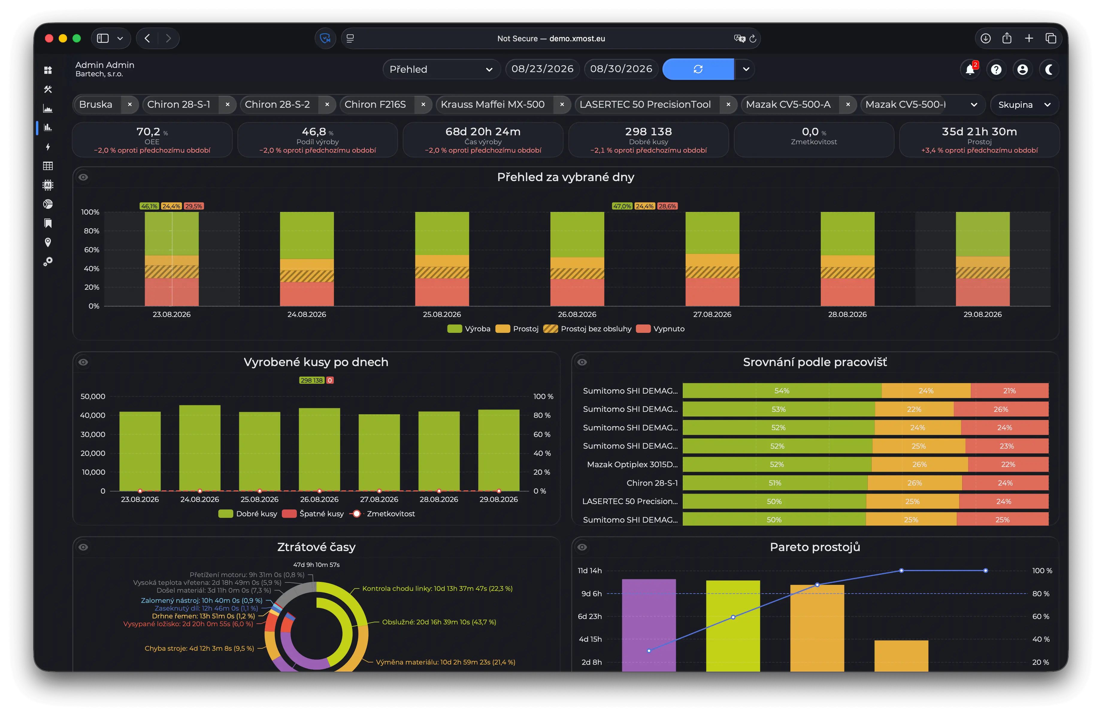
One statistics option, headline numbers over five charts 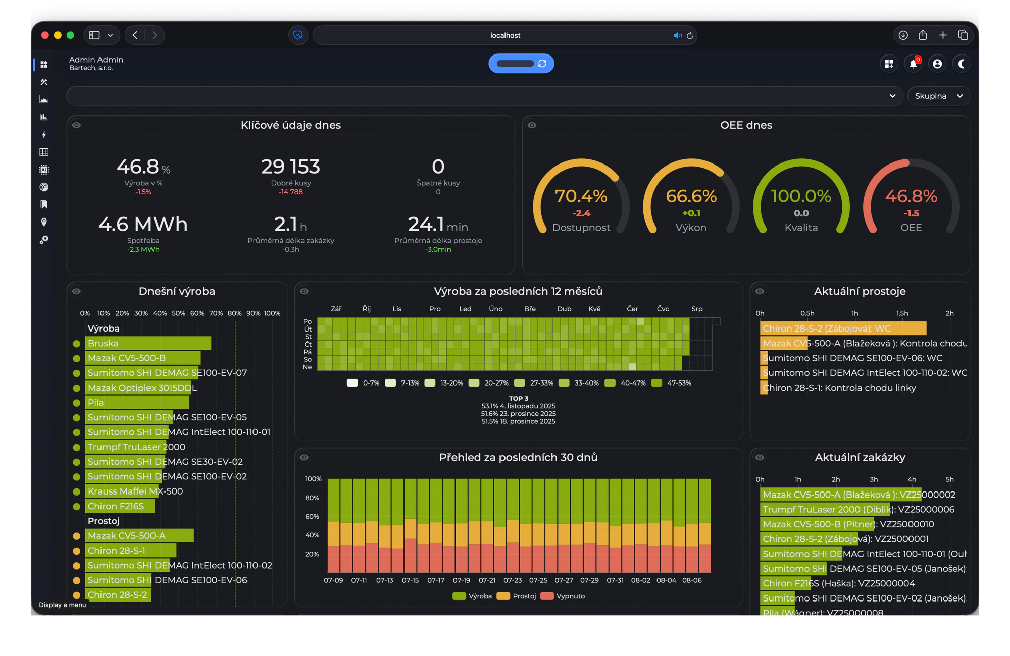
The dashboard in the glass look 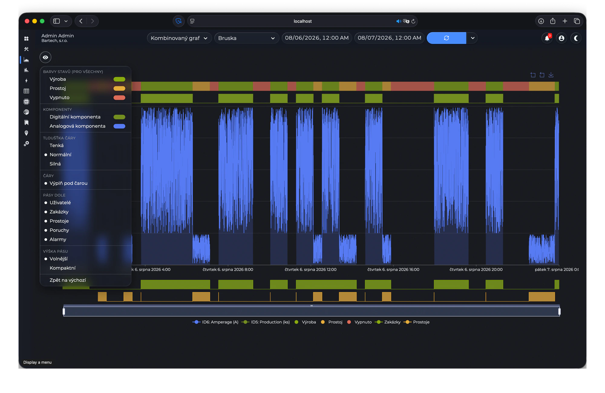
Chart colours and strips, set the way you read them Improved
- The device connectivity tile now really asks the network. Every device is pinged once a minute, touchscreen terminals included, and addresses with a port work too. A red row has been silent for three minutes straight, so a single dropped packet never raises an alarm, and every row shows how long ago the device last answered. Whole device types can be hidden, and an offline-only view narrows the list to what is unreachable.
- The colour picked for a downtime or a breakdown in settings is used everywhere the reason shows: the strips under the charts, the statistics charts, the dashboard tiles, the workplace cards and the overview page. A reason with no colour of its own keeps the colour of its state.
- Workplace cards show a target beside today's and the shift's production, counted from the cycle times of the orders that actually ran. The dashboard workplace tile carries the same numbers.
- The daily bar charts separate the weeks: a dashed line where one week hands over to the next, a tint over the weekend columns, and each week's production, downtime and switched-off shares added up above it. The shift tile reaches 30 days back, labels its columns by the day the shift started, and names in its tooltip who was signed in.
- People are shown surname first across the whole application, which matches how most shop floors list them.
- A web address written into a layout's note takes over the layouts page, so a live page from another system can stand in for the drawn plan.
- Translations got a full audit across all eleven languages, with several hundred fixes: warehouse terms that read as stock-exchange shares, alarms translated as alarm clocks, Czech words left in other languages, Latin letters hiding inside Cyrillic words, day and month abbreviations, grammar and typos. Existing installations pick the fixes up on the first start, and a text you retranslated yourself is never overwritten.
- A pass over the smaller things: every top bar icon is drawn at one size, dropdowns size themselves to their longest option, menus and confirm dialogs open clear of the control they belong to, chart legends sit under the zoom slider, only one workplace detail panel is open at a time, the column dialog has a grip to drag rows by, and card action icons moved out of the way of the numbers.
- Every view menu names its groups. The eye button, on a page or on a single tile, opens the same shape everywhere: a small caption over each block saying what the rows under it answer, the period, the measure, the sorting, the limit and what to show, so you can go straight to the row you want instead of reading the whole list. The menus on the dashboard, statistics and energy tiles had only dividing lines until now.
- The energy page is in everyone's menu, where only the built-in administrator account used to have it. Its view menu opens for everyone, not only an administrator, and weekends, cost and the low tariff band are picked once in it instead of separately on each chart. The tariff prices under them stay an administrator's.
- The data page's view menu has a Fit to window switch. With it on, the table shows only as many rows as the window has room for, so the search box, the table with its totals, the pager and the row count are all on screen at once with nothing to scroll. The rows box then reads 15 → 13, the count you picked and the count that fits, and a taller window gives the rows back up to your pick. It is off until you turn it on and is remembered per person.
- Everything the server sends is compressed on the way out. The dashboard's first load went from 4.5 MB to 1.2 MB and a five thousand row table from 1.4 MB to 93 kB, so pages arrive faster over shop floor WiFi or a VPN and cost far less on a connection you pay for by the megabyte.
- Charts open quickly however long a range you ask for. Instead of sending every reading in the database, the thinning happens on the server and keeps the highest and the lowest reading of every step, so a spike one reading long is still drawn at full height. The user chart is around ten times faster, a month for someone who worked twenty machines went from twelve seconds to just over one; the strips under a chart are read all at once instead of one after another; and the data table sends its rows once instead of twice, which took a month of downtimes from thirteen megabytes to a third of that.
- The server stopped repeating work it had already done: the timezone is read once at startup instead of for every formatted cell, a page no longer looks your language up once per word, the dashboard's tiles share one calculation of the day's numbers, and stylesheets and scripts are compressed once and kept.
- The login page tells you why a login failed, in the language your browser asks for, instead of only flashing the button red. A wrong address and a wrong password give the same wording on purpose, so the form cannot be used to find out which addresses exist.
- The dashboard's edit button moved from the top bar to the left end of the filter bar, where the eye button sits on the other pages. While you edit, the add and reset buttons appear beside it, the workplace filter makes room for them, and the name of the dashboard you are working on shows next to the refresh button.
- Sorting a table by a column is a three-step click now: ascending, descending, and a third click puts the rows back the way they arrived. The sorted column's heading turns blue with a chevron pointing the way the rows run, and unsorted headings carry no marker at all, so the column you sorted by stands out instead of a row of arrows at three different heights.
- On the data page a click on a value in a row narrows the table to the rows carrying that value: the value lands in the search box as a term in quotes, Alt+click excludes it instead, and a second click on the same value takes the term out again. The search box understands quotes now as well: a term in quotes has to match a whole value, so "CNC 5" finds the workplace CNC 5 and not CNC 50 with it, spaces and brackets included.
- Number cells in the data tables carry a bar behind the value: a count, a duration or a consumption gets a bar as long as its share of the largest value in the column, and a percent is tinted by the percent itself, so the longest downtime or the biggest batch stands out without sorting. The bars are measured over the rows a search leaves, so narrowing the table spreads them out again, and the eye menu switches them off.
- The bars have switches of their own under Data bars in the eye menu: percents, numbers, durations and the group rows each turn on and off separately, so a table of eight percent columns can keep its tints and drop its bars. A bar that fills its cell stops short of the next column, so two full bars side by side read as two.
- The data tables can be grouped. The Grouping block of the eye menu folds the rows into groups by a workplace, a reason, an operator, an order, a product or a day, and every group gets a row of its own with the value, how many rows carry it and the same sums and averages the totals row shows. A click on that row folds the group shut, with Shift every group at once, and a table folded shut is a table of its groups. Sorted by a number column the groups line up by their sums, so a month of downtimes grouped by reason and sorted by duration is a Pareto without leaving the page. The grouping is remembered per table.
- The data tables export to Excel and to the clipboard as well as to CSV. The export button became a capsule: its main half writes the file in the format you used last, CSV until you pick another, and the caret beside it opens the three, so a plant that lives in Excel gets its workbook from the first click on every visit. The Excel file keeps its numbers as numbers, the counts, percents and durations add up and the dates sort, with the header row bold, frozen and filtered, and the sheet named after the table. The clipboard copy pastes into Excel, Sheets or a mail as cells. The file is named after the table and its days, and the CSV separator follows your language, a comma for English and a semicolon where the decimal mark is itself a comma.
- An opened bar chart names its columns up the inside of the bars, on the dashboard and on the statistics page alike, in the size of the workplace list and in your appearance's text colour. The row of names under the axis is gone, so the plot reaches down into its room, and the columns that carry a name leave their figures out so the two don't print over each other. Columns too narrow for a name keep the names under the axis.
- The time axis of the charts is labelled in two levels: the hours say only the time, midnight says the day and the first of a month says the month, so a week shows its dates instead of losing nearly every label to overlap. Zooming into a day relabels the axis in hours.
- A chart with nothing to draw says why, whether no workplace is picked, the workplace has no analog, digital or counter port, the period holds no readings or no state records, or no user is picked or the user has no records, instead of drawing empty axes.
- The tooltips of the order, downtime, breakdown and user strips under the charts show the record's note, with the operator's line breaks kept, and the order tooltip gives its ideal count in whole pieces instead of six decimal places.
- Every view menu opens under its button and scrolls inside itself when it's longer than the room below, instead of jumping above the button or filling the window. Only a button near the bottom edge of the window opens its menu upward.
- While a page loads, its whole top bar is locked, the pickers and the dates as well as the apply button, so a second pick can't start a load halfway through the first.
Fixed
- Jumping to a data table, a statistics option or a chart type from the search box left the page on the view it had before; it opens the one you picked.
- The cross at the end of the data table's search box cleared nothing; it empties the box and brings every row back.
- Typing a search with
&&or||in it broke the table search on the data, energy and statistics pages the moment the second character was typed. A half written expression is read as far as it goes now, soalpha &&filters on alpha until you finish the rest of it. - Saving or deleting a place, or a maintenance assignment on a workplace, reported an error although it had gone through, so the same thing was often saved a second time, and the assignment was written to the database twice on every save anyway. A maintenance PDF over about eight megabytes could not be attached at all, because the browser packed it into a shape four times its own size and the result came out over the size the server accepts. Both work now, and a damaged file is refused instead of stored as a broken PDF.
- Several dashboards refreshing at once could leave a page waiting with nothing on it, because one dashboard asked the database for everything on it in the same moment and took every connection the server had. A dashboard reads its tiles a few at a time now.
- The layout editor opened without asking who you are, so the floor plan and the live state of every machine on it could be read by anyone who knew the address. Opening and reading ask now too.
- An interval below zero on a maintenance task could be stored through a hand made request, and the background job then wrote maintenance requests in an endless loop, filling the table and stopping every other background job with it. Such an interval is refused now.
- An oversized file uploaded through a settings form was read whole into memory, and asking the statistics page for a very long period read every record of it into memory at once; either could take the server down. Uploads are capped like every other request, and a period that is too large is refused with a message asking for a shorter one or fewer workplaces.
- The workplace filter on the statistics page was ignored on most options when the workplaces you had picked no longer existed, so the page quietly drew the whole plant, and renaming a workplace could do the same. Every option matches the same way now, a selection that finds nothing draws nothing, and picking somebody who had since been deleted no longer draws an empty page and writes an error into the log.
- Screens no longer fall over on a value the browser sends back half formed. Saving a brand new device, workplace, workplace mode, section, port, maintenance, maintenance type or place reported a database error because a row that does not exist yet has no identifier; the row is now simply created. Deleting a row that had never been saved just closes the form, and a list entry arriving without its identifier is refused with a message instead of taking the save down with it.
- The whole floor percentages on the dashboard and in the statistics overview counted every workplace the same, so a workplace that reported nothing on a given day pulled that day's production down as if it had run and produced nothing; each day is weighted by the time its workplaces actually measured now. Production time in the workplace chart and the three time columns in the overview table were worked out from the day's percentage against a full twenty four hours, so a day measured only in part came out too high; both print the measured time now.
- A shift the workplace spent in a single state was booked the whole shift from its first minute, so a shift still running showed a full shift's production before it had run. It grows with the elapsed time now.
- The AI assistant was told that the table it takes production, downtime and power off totals from holds one row per workplace per day. It holds one per hour, so an answer that counted or averaged those rows could come out wrong. An answer cut short by a dropped connection also arrived looking finished; a broken stream is reported as one now.
- Three tables printed the wrong thing: the overview statistics summed every downtime, breakdown and alarm under one empty name because the reason names were never loaded, the alarm table printed the end time in the processed column so an alarm looked dealt with when it stopped ringing, and a workplace that has never reported anything showed a hundred thousand days in its state instead of a dash.
- The thirty day cleanup of the web user records never actually ran, so the table had been growing since the day it was written, and the attempt to clean it was made on every single page you opened.
- Layout files are rebuilt from the database whenever they are missing, so a plan uploaded after the server started opens and one that was already there no longer opens as a missing file. The layout page stays in sync after an edit and no longer writes a log line for every workplace on every refresh, which a plan left on a wall display used to fill the log with.
- Several headings and labels were left untranslated or written inconsistently: the alarms, log out and appearance buttons and the button opening the layout editor stayed English, charts printed English month and day names for Ukrainian, bookmarks, layouts and reports lost their capital letter in the settings list, Czech had a heading in title case, French did not agree its adjectives, five languages called a breakdown a medical disorder and Russian called an alarm an alarm clock.
- Chart gridlines and the empty days in the calendar heatmaps were a fixed light grey, so they stayed bright in dark mode, and in the classic appearance the gridlines were a tint of the page, showing as a pale streak over a ranked bar and as nothing beside one. Both appearances draw them in the same colour now.
- A period holding a single bar drew that bar across the whole chart, on the statistics and energy pages both, and a single day in the heatmaps came out as one solid block; a bar keeps a sensible width now however few of them there are. The energy chart also says what its numbers are in, one unit on the consumption axis from the zero up and the currency on the cost axis.
- The created and updated stamps on the settings forms were in the server's own clock rather than the configured timezone, so they ran an hour or two behind the data pages for the same record. They follow the timezone setting now.
- The page grew and shrank in width as the window changed height, and in Safari and Chrome the scrollbars had no thumb to drag. A rule that only meant to keep the cursor an arrow over a scrollbar had switched the browser to drawing its own; the browser's scrollbars are back and the width stays put.
- In a compact table the heading text ran under its sort marker; the marker has its room in every density now, closer to the heading, and clicking a heading three times in a row no longer selects its text.
- Last three days in the quick date menu started three days back at the current time rather than at midnight, unlike every other range in it.
- Smaller repairs: date fields no longer go blank while you are typing, clearing a number in settings empties the value instead of writing a zero and the field takes decimals again, resetting the chart colours puts back the colours the system really ships with, workplace cards in a row are all the same height, a sliver of background no longer shows under the active page number in table pagers, the layout editor and the data page no longer serve the previous version's stylesheet or translations for a day after an update, and the embedded bookmark pages no longer show an External bookmark tooltip wherever the mouse rests.
- The statistics day charts drew a vertical axis line through their first bar whenever the weekend tint was on, and only then, while every other chart drew none. Every axis that carries figures now draws the classic way, a solid line with tick marks at the edge of the plot: the value axis of a trend, on both sides where a chart carries two, and the percentage or hours axis over a ranked bar chart, on every page.
- The colour scale above a statistics heatmap has two handles now, like the one on the energy page: drag them and only the cells in that range stay coloured. The date row under it moved down, so the figure the scale shows no longer prints over the dates.
- The chart type and machine pickers in the top bar of the charts page dropped their list open but ignored every click in it, so the page stayed on whatever it had opened with. The kind picker on the data page could go the same way. Both pick again.
- The background job that writes the shift summaries every minute could use up all of the server's memory and take the application down, again after every restart. Whenever it had to go far back, as it does for a new workplace with shifts or after a recalculation from an old date, it read that whole history at once. It works through it a week at a time now, and the log says which period it is calculating.
- Hovering a column printed the figure that had been left out for lack of room, right over its neighbour. Figures stay as they are under the pointer now, and the tooltip is what gives you the number.
- A list or ranking that grows with its rows, on the dashboard and on the statistics, charts and energy pages, could come out with its rows squeezed and the names printed over each other until the window was resized.
- A chart could open with its axes, its total and a working tooltip over an empty plot, and stay that way until something redrew it. Charts appear complete from the start now, and still move when they change.
- Record lengths in the chart tooltips were written as a time of day: an hour long record read "Thursday 01:00:48", and anything over a day wrapped round, so a thirteen day record read "12:30:00". They read "13d 12h 30m 0s" like every other length in the application.
- The folded side menu shows the page's name beside the icon under the pointer again.
- Long workplace names squashed an opened bar chart into the bottom quarter of its tile, because the names written up the columns ran past the top of the chart and the chart shrank to make room for them. A name ends where the plot ends now, with an ellipsis. On the dashboard, the names under the axis start at the first column and end at the last, so a long first name no longer shoves the whole plot sideways.
- A range crossing the autumn clock change counted that Sunday twice on the statistics page, and the week and month sums with it, and a range ending after midnight, a night shift or the last 24 hours, left out its last day. Both follow the local calendar now. The OEE of a range shorter than a day was held against the whole day, so one shift read a third of what it was; the plan and the calendar time are now counted for the part of each day the range covers and that has already passed.
- On the days the clocks change, the shift lines on the charts and the shift summaries behind the shift tiles were an hour off, and just after midnight inside a night shift the Current workshift and Previous workshift ranges pointed into the future.
- A data table or the orders statistics over a range touching more than 65,535 runs, orders or operations lost the order and operation names, because the database refuses a list that long in one question. They are read in parts now.
- The operator figures on the statistics page counted a person's time twice when they had signed on to a run they had started themselves. The dashboard never did, and the two agree now.
- The search box found no order, operation, product, part or package with diacritics in its name, typed with them or without, because it dropped them from the typed words before asking the server. It finds those names either way now, and so does the search box of the details page.
- Search from anywhere. Ctrl+K (⌘K on a Mac), or the magnifier in the top bar, opens one search box over every page. Type a few letters, with or without diacritics, and it finds pages and their views, machines, named dashboards, settings sections and the entries inside them, the manual's sections and your AI conversations, with the letters that matched highlighted. Anything else goes to the AI assistant as a question.
-
April to June 2026
2026.2
New
- AI assistant. Ask about your production in normal language and get an answer with a chart. Click into any bar or slice to drill down, open a chart fullscreen, and choose per chart how it is drawn. Works with Claude, OpenAI, Gemini, Grok and local Ollama models, set up in settings, with a page showing what it costs you. The assistant only ever reads data, never changes it, and never shows database internals.
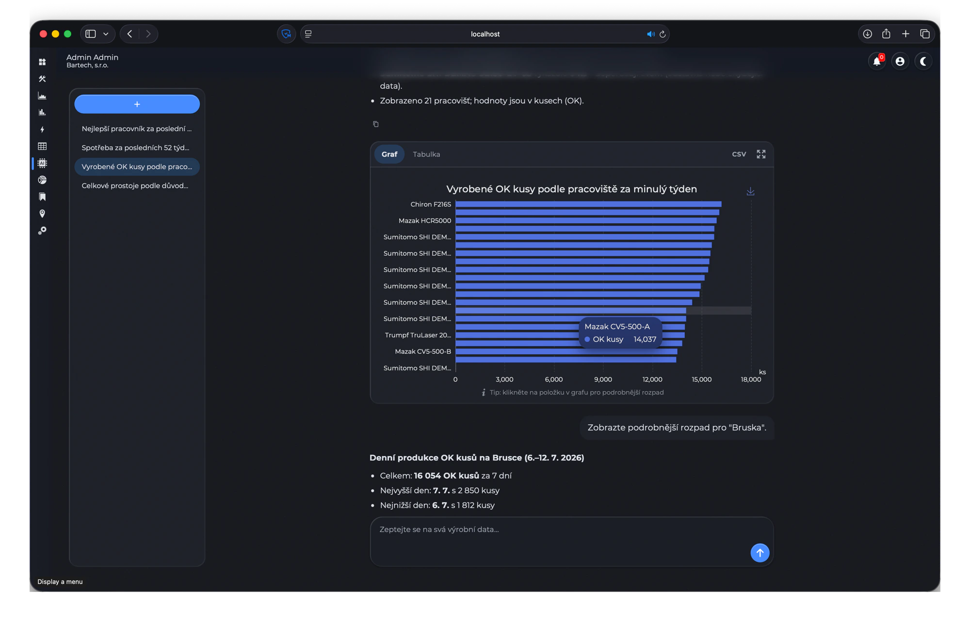
The assistant answering a question about production - Interactive layout editor. Upload a floor plan as PDF or image in settings, then place workplaces on it directly in the browser. Anything uploaded in settings opens in the same editor, and the layout page shows the result with live workplace states. Translated into all 11 languages.
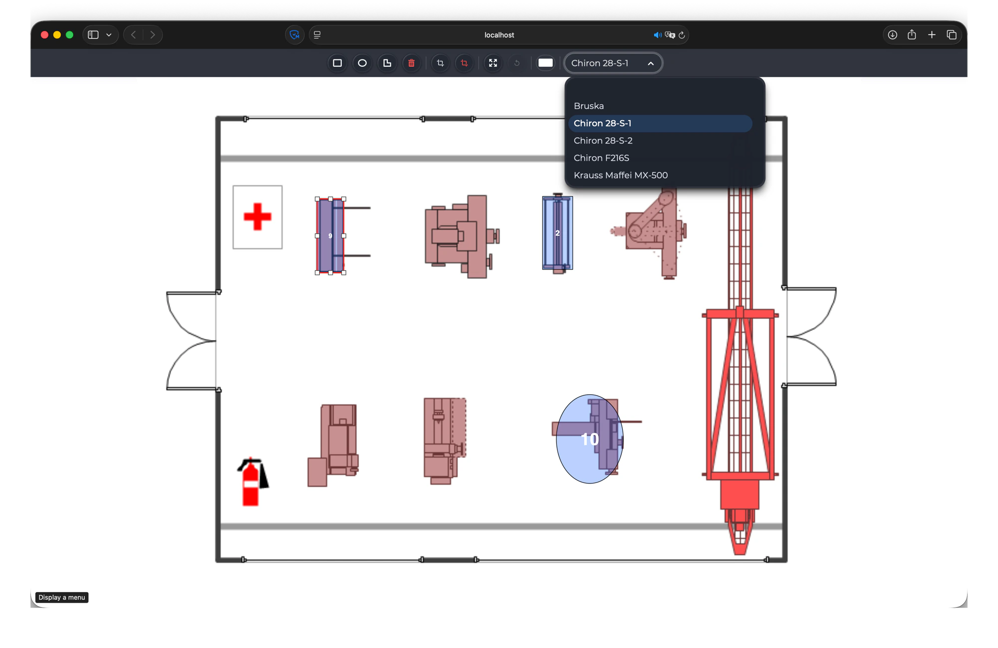
Placing workplaces on a floor plan - Redesigned workplace cards: state colour, OEE, today's good pieces, a bar showing how the time was split, and the biggest downtime reason. A side panel slides out for the rest. Cards are ordered by state and then by name, open cards stay open when the page refreshes, and clicking the workplace name goes to its charts.
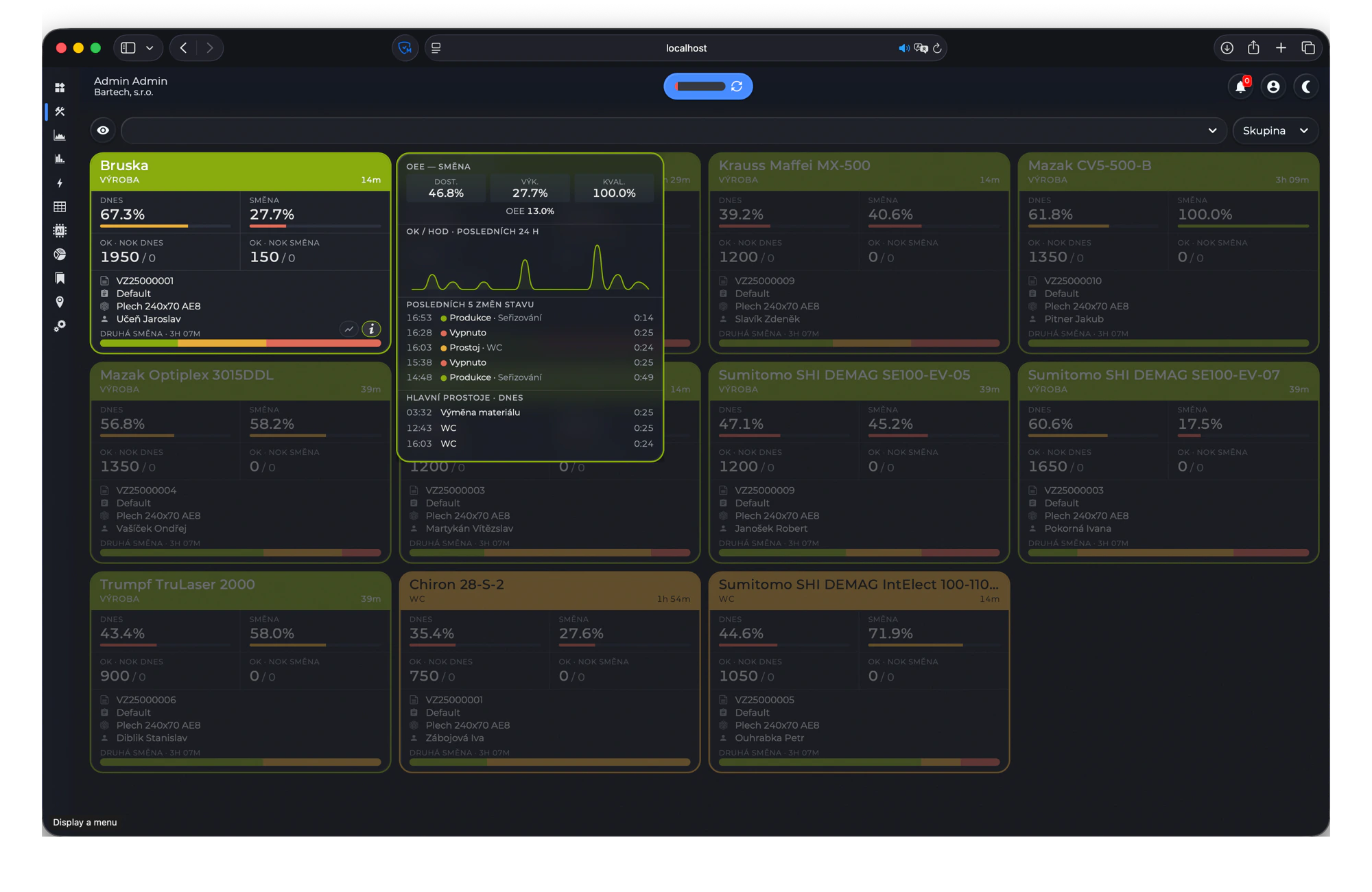
The workplaces page with a side panel open - Choose which columns you see on the data page and drag them into the order you want. Saved per user and per table, with a reset back to the default.
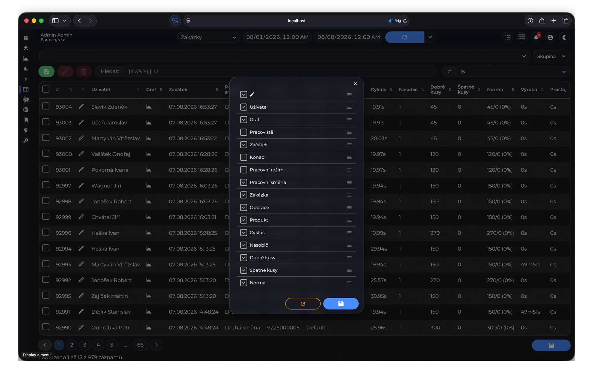
Choosing the columns of a data table - Light and dark mode are back, done properly this time. Named themes instead of hand written rules per chart, and the switch is instant with no page reload.
- Admins can add, edit and delete maintenance records, order records and downtime records straight from the data page.
- Maintenance gained requested and measured values, a requested date, type and text columns, a PDF attachment per task, and notes you can read and edit in the record dialog.
- Quick date ranges (today, yesterday, this week, last week) on the charts, data and statistics pages.
- Summary recalculation can be limited to the workplaces you selected, and asks you to confirm before it runs.
- Every settings page now works the same way: the same form, the same save and delete, file upload with a button to clear it again, and a confirmation before saving.
Improved
- Large speedups on the pages people use all day. The overview page went from around 7 seconds to under one second, the workplaces page from around 14 seconds to around 200 milliseconds, and the charts, statistics and data pages got the same treatment.
- Analog charts keep their real peaks and dips when zoomed out instead of smoothing them away.
- Order records in charts take the colour configured on the order.
- OEE quality counts as 100% when a workplace has no piece counters, instead of quietly dragging OEE down.
- Statistics stop at the start of today, and the from date can no longer be set later than the to date.
- Menus and selection lists sort correctly with accented characters.
Fixed
- Page loads no longer hang now and then.
- Maintenance stopped creating duplicate records when the schedule fields were empty, stopped crashing when saving a workplace, and now handles workplace names that contain brackets.
- Statistics no longer loop forever when a date range crosses a timezone boundary.
- The chart crosshair lines up again across stacked charts.
- Settings child tables no longer overlap the list above them or keep a selection from the previous row.
- Downtimes with nobody assigned show a proper "no operator" label instead of a blank.
Removed
- The info panel with support levels.
-
January to March 2026
2026.1
New
- Notes on the data page. Every note shows when it was written, by whom, and which workplace, product, order and operation it belongs to, so a remark made at the machine can be found again months later. Deleting one asks for confirmation and keeps the record recoverable instead of throwing it away.
- A free JSON field on every settings detail page, coloured so it stays readable while you edit it. Anything your installation needs that has no field of its own can live there.
- Energy consumption can be calculated from the number of phases set on the workplace.
- PDF layouts render directly on the layout page.
Improved
- The settings menu is sorted alphabetically, so you stop hunting for entries.
- Data export reworked.
- The data selection menu sorts accented names properly.
- Summary recalculation reports what happened and stops on an error instead of carrying on quietly.
Fixed
- Date filtering on orders and downtimes.
- Workplace statistics were looking up cached data in UTC instead of your own timezone.
- Records that stretch past the selected range are cut to the range, so durations add up.
- Records with no end time no longer break downtime and order statistics.
- The right port number is picked when several are configured, the power factor is checked when saving a workplace, and every admin sees the full data.
-
October to December 2025
2025.4
New
- Filters take a NOT operator, so you can exclude instead of only include. The filter box shows the syntax it accepts, something like
(X && Y) || !Z, so nobody has to guess. - Filter box on the multiple selection dropdowns, so you type a few letters instead of scrolling through every workplace.
- The export button exports the view you are looking at, with your filters applied, semicolon separated for spreadsheets.
- Threshold field on device port settings.
- Operation and product information shown on the workplace cards, so you see what is running without opening anything.
Improved
- Data tables scroll sideways when there are more columns than screen, and you pick how many rows per page, from 5 up to 25.
- Chart lines lost the arrow markers and got a proper line width.
- Chart grid margins line up.
- Default query for orders reworked so the first load is the range you expect.
Fixed
- Tooltip position in Chrome.
- Charts are disposed of when you leave a page, so they stop interfering with the next one.
- Support portal link.
Removed
- Light and dark mode. Every chart had its own hand written dark version and keeping them all correct had become unworkable, so the toggle came out for a while. It came back in 2026.2 built on named themes.
- Filters take a NOT operator, so you can exclude instead of only include. The filter box shows the syntax it accepts, something like
-
July to September 2025
2025.3
New
- Advanced filtering on every data table. Type an expression with logical operators and narrow thousands of rows down to the ones you care about.
- Compact mode for the data table, so more rows fit on screen.
- Tooltips on workplace cards.
- Support overview with a contact address in the info panel.
Improved
- Date ranges are decided by the server, so what you see on screen matches what gets calculated behind it.
- Workshifts that run over midnight are calculated correctly.
- Durations in tables are formatted without pointless trailing zeros.
- Device type is shown in the devices table.
- When the server cannot answer, you get a message saying so instead of a page that silently does nothing.
Fixed
- Virtual port calculation, and saving virtual port settings written with a comma instead of a dot.
- Combined chart colours stay the same between loads.
- Workplace selection display.
-
April to June 2025
2025.2
New
- Dark mode across the whole application, charts included. One click in the top bar and every page, table and chart follows.
- Secure HTTPS access using your own certificate.
- Maintenance notes you can read and edit from the data table.
- Maintenance schedules that repeat on a set number of days.
- Power off time tracked in the daily and shift summaries.
Improved
- Redesigned login page.
- Rows containing a failed check are highlighted, and stay highlighted as you page through the table.
- Refresh buttons show that they are working instead of looking dead.
- Workplaces are ordered by state and then by name, so the ones needing attention are at the top.
Fixed
- The quality part of OEE and the data overview used the wrong formula.
- Workplace ports in charts are sorted by name, so charts look the same every time you open them.
-
January to March 2025
2025.1
New
- A proper login page, with your company name on it, replacing the browser's own username and password box. The old one could not be styled, could not be translated, and could not tell you why a login failed.
- Ukrainian added to the languages.
- Help button on the pages that have a tour.
Improved
- Charts load without blocking the rest of the page, so one heavy chart no longer freezes everything else on screen.
- Chart labels, axis lines, tooltips and bar widths reworked so numbers are readable at a glance.
- Table pagination reworked.
- Workplace cards restyled.
- When the system runs into a database problem it reports it by itself, so nobody has to notice a blank page first.
Fixed
- Downtime calculation.
- Login behaviour after a page reload.
- Workplace duration when no user is assigned.
-
October to December 2024
2024.4
New
- The layout page refreshes itself every few seconds, so a floor plan can be put on a screen on the wall and left alone.
Improved
- All the chart types moved into one file, so the charts page loads fewer things and opens faster.
- The statistics, workplaces and settings pages had their markup reworked, so spacing and alignment are the same everywhere.
- The full timezone database ships with the application, so times are shown in your zone whatever the server happens to be set to.
Fixed
- Order record handling.
-
July to September 2024
2024.3
New
- Maintenance. Define maintenance tasks per workplace, let the system create the records on schedule, and follow them in a table on the data page. Places were added as well, so equipment that is not a workplace can be tracked the same way.
- ID columns in the tables, so a row can be referred to without ambiguity.
Improved
- Order durations added to the order data.
- New fonts and page styles.
- Dropdown widths and delete behaviour across settings.
Fixed
- Chart pointer value range.
- Save and delete buttons acting on the wrong row.
- Date handling and the user shown on a record.
-
April to June 2024
2024.2
Improved
- Data export uses a semicolon, so a spreadsheet opens the file straight away with no import wizard and no columns crammed into one.
- Summaries are calculated up to the current time when no newer data exists, instead of stopping at the last record.
- Faster settings and workplace pages.
- Updating downtime and order records is capped per run, so a large recalculation cannot stall the rest of the system.
- Alert buttons restyled.
Fixed
- State records in the combined chart.
- Loading data on the workplace page.
- Chart toolbar handles, and the date and time in chart tooltips.
-
January to March 2024
2024.1
New
- You are told when the database configuration has changed under you, rather than seeing empty pages and wondering.
- Timezone data ships with the application.
Improved
- Analog charts draw only the first port by default. A workplace with a dozen sensors used to take forever to open, now it appears at once and you add the ports you actually want.
- Charts, statistics and the overview page redrawn.
- Page width behaves the same on every page.
- The platform underneath was rebuilt for stability, with shared database connections and proper behaviour when the database is unreachable, so a database hiccup no longer takes the whole application down with it.
-
October to December 2023
2023.4
Improved
- An order record updated with consumption gets a note saying where the number came from, so an energy figure on an order can be traced instead of taken on faith.
- A default weather setting is created if none exists.
- Tooltips across the application.
New
- The system sends its device information when it starts, so support knows what you are running without having to ask.
Fixed
- Consumption for order and downtime records.
- Charts reloading the same order record over and over.
- Caching of workplace ports, and logout.
-
July to September 2023
2023.3
New
- Device port calculation is drawn while you configure it, so you see what your formula does to a real signal before you save it. Four decimal places instead of two, which matters on slow counters.
- Recalculate summaries for a period you pick on a calendar, straight from your own profile.
Improved
- A report can list several addresses, and the first one that answers is loaded, so a report survives one server being down.
- The year is shown next to the month in date formats across the application.
- The info bar stays where it is instead of scrolling away.
- Summer theme.
Fixed
- Saving a workshift note, deleting a workplace, checklist translations, and consumption in the summaries.
-
April to June 2023
2023.2
New
- Consumption types per workplace. The settings form changes to match the type you pick, so energy is calculated the way your meters are actually wired.
- Holidays, shown on every page.
- Weather.
- Pagination for device and workplace ports.
- Spring theme.
Fixed
- Workplace and device ports in charts.
- Initial state of the timeline chart.
-
January to March 2023
2023.1
New
- Click through from the data and orders tables straight into the chart for that record, at that moment, instead of copying dates by hand.
- Zooming a chart shows start, end and duration, plus a field that divides the span for you.
- New user chart.
- Product on the order data.
- A workplace can have more than one terminal.
- Power factor in the workplace settings and in the consumption calculation.
Improved
- Product cycle time takes decimals.
Fixed
- Consumption calculation.
- The layout page when no layout is available.
- Click through surviving the automatic refresh.
-
October to December 2022
2022.4
New
- Checklists, finished and working, with the filled in records shown on the data page.
- Consumption calculated for order and downtime records, with a consumption column on both.
- OEE gauges on the statistics page, and OEE in the overview calendar.
- Production, downtime and power off time in the overview table.
- ARM build, so it runs on small hardware next to the line.
Improved
- Consumption charts switch between Wh, kWh and MWh as the numbers grow.
- Alarms notify Microsoft Teams.
Fixed
- OEE over ranges shorter than a week.
- Tooltip position, port colour saving, workplace workshift saving, and the latest date and time shown in statistics and charts.
-
July to September 2022
2022.3
New
- Shop floor layout page. See your workplaces on a real plan of the floor, coloured by state, with details on hover.
- Shift summaries.
- More information on the workplace page.
- Chart axis labels.
Fixed
- Layout tooltips and email parsing from the layout.
- Caching of workplaces and their ports.
-
April to June 2022
2022.2
New
- Bookmarks. Pin any page you use into the menu, configured in settings, so the shift report or the ERP screen sits next to everything else instead of in a browser tab somebody closed.
- Delete is available everywhere in settings, not only in some places.
- Overview table on the data page.
- Calendar colour settings.
- Support for special I2C ports.
Improved
- Duration in chart tooltips, and more information on the statistics page.
- The database connection is checked at startup, so a wrong configuration says so instead of half loading.
Fixed
- Analog chart tooltips.
- Production duration for workplaces in statistics.
- Port colour and name in the data tables.
- Calendar data on the days the clock changes.
-
January to March 2022
2022.1
New
- Reports. Put your own reports in the menu and configure them in settings.
- Workplace sections, so workplaces can be grouped and filtered as a group.
- Statistics for packages.
- Voltage per workplace, used in the consumption calculation.
- Your selections and menu state are saved and restored the next time you log in.
Improved
- Charts draw on canvas now, between two and ten times faster than before.
Fixed
- Wh, kWh and MWh formatting.
- Summary record calculation and the dates loaded for statistics.
- Barcode saving on orders.
- 24 hour times in chart tooltips, and workshift start and end validation.
-
October to December 2021
2021.4
New
- OEE donut at the top of every page, and clicking it takes you into the OEE statistics.
- Norm data in the tables and charts.
- Consumption statistics, per week and per month.
- Three way button on the charts.
Improved
- Everything is calculated per workshift.
- New caching layer, so the overview, workplaces and statistics pages open from cache instead of recalculating every time.
Fixed
- The end of the selected date range on the overview and statistics pages.
- Consumption calculation and caching, tooltips, and cursors in the top menu.
-
July to September 2021
2021.3
New
- Statistics finished: overview, OEE, downtimes, breakdowns, alarms and orders, each with its own charts.
- Interactive tour for people opening the application for the first time.
- Alarm button showing how many alarms are open.
- Colour dot on the overview page telling you each workplace state at a glance.
- Workshift calculation on the workplaces page.
- Web user records on the data page.
Fixed
- Workplace numbers in the overview statistics.
- Day names in the OEE statistics, and several translations.
-
April to June 2021
2021.2
New
- Charts. Analog, digital, combined and production, with zooming, panning and tooltips. Tested on more than four million data points.
- Overview page: production overview, terminal data, a calendar heatmap of productivity, power consumption, a 30 day table and workplace selection.
- Data export from the data table, and a compact table toggle that remembers your choice.
- Logout button.
Improved
- Faster production and consumption calculation.
- Layout, cursors and tooltips made consistent across every page.
Fixed
- Remembering the workplaces you picked on the data page.
- The assigned user on the downtimes table.
- Chart resizing, and sorting on the timeline chart.
-
January to March 2021
2021.1
First release of the web application.
- Workplace overview with live data, so the floor is visible from any browser.
- Data page covering orders, downtimes, alarms, breakdowns, faults, packages, parts, states, users and system statistics, each with a date range, workplace selection and export.
- Settings for everything: workplaces and their ports, devices, users, states, breakdowns, downtimes, faults, packages, parts, products, operations, orders, alarms, workshifts, system settings and your own profile.
- Charts with their own menu, starting with the analog chart.
- Translations, a responsive layout that works on a tablet, and login.
- The application remembers your last selection, your workplace and whether the menu was open.
- Workplaces page loads in under 100 milliseconds.